Friday Joy: The New Antiracist Dietitian Logo
It feels like me and us and this space we are building together.
About a month after launching this newsletter, I started looking around for someone to design a "real" logo to replace the slapdash thing I put together on Canva. I really wanted to find someone who would get the newsletter and understand why I write about the topics I do. I could not imagine working with someone who felt uncomfortable talking about racism, or who couldn't comprehend the feelings I wanted to elicit with the look of my newsletter.
So I feel incredibly lucky to have found Mickey (Michelle) LeClerc and Lysistrata Karch-Coar of LeClerc Illustration & Design, and am excited to share a bit more about the process of working with values-aligned designers as a solopreneur, as well as a behind-the-scenes peek at creating the new look for Antiracist Dietitian — what inspired me, what I was going for, and how that all got translated in the end into a new logo, website header, and email banner.
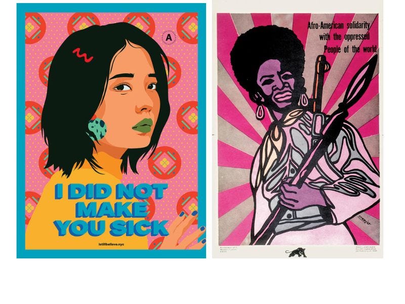
I am not someone who keeps a running list of logos I love, and to be honest, I rarely paid much attention to other people's Substack logos, partially because Substack keeps them so teeny-tiny. When I had my initial meeting with Mickey, all I knew was I wanted protest posters to be part of the inspiration. I especially love the work of (fellow part-Thai person) Amanda Phingbodhipakkiya and the posters in her I Still Believe series, as well as posters by Emory Douglas, the Black Panther Party's minister of culture.
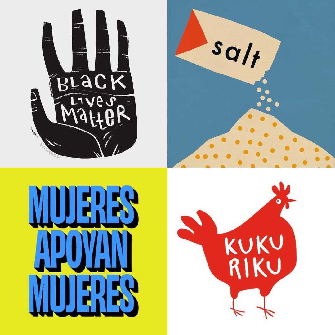
Mickey encouraged me to make a Pinterest board of logos, typefaces, or other design inspiration that I liked. So I just went to Pinterest, searched terms like protest poster design and typography design, started adding images I liked to a board, and the algorithm helped serve up more ideas. I started to realize that what I was drawn to was a DIY, zine-like feel, which made a lot of sense to me.
I had my own zine in high school called Super Witch, very much inspired by the riot grrrl music and social scene that I was part of in the mid-90s. I realized the mix of rage-fueled creativity, deep feelings, and joy in creating and connecting with others that were part of my zine-making days were also at the core of Antiracist Dietitian, so many years later. I wanted to evoke that.

After I shared the board with Mickey, she pulled out some of the themes she saw, and put together moodboards with more examples. Some of the elements that showed up were block- and screen-printed illustrations, hand-drawn typography, '60s protest typography, and vibrant colors. We talked through the additional examples she provided, and I pointed out elements I liked or didn't like. We thought some kind of food illustration would be a good fit, and I mentioned that instead of the orange cross-section I currently had, some kind of fruit with more of a link to Asia would resonate with me.
The next step was maybe my favorite because I got to see my ideas and input translated by Mickey and Lys into a bunch of completely original designs. They did everything in black and white so I wouldn't be distracted by color. They came up with eight designs; these were my top three.


